Friday, April 23, 2010

Blog

https://www.msu.edu/course/tsm/251/DigitalPortfolioGuidebook.pdf

This link seems like it will be very useful when I am putting my digital portfolio together. It is a very clear and concise guide to what one should think about and gather when completing their own digital portfolio. I intend to try and use this guide as a checklist when working on my own.

Saturday, April 17, 2010

Peer Reviews

The first blog I reviewed was Nicole Smith's (http://smithnr01-nicolesblog.blogspot.com/), and I chose this blog because I was at the top of the list, and as per instructions I was to choose the person at the bottom of the list. I chose to comment on her posting with the photobucket assignment because I was curious to see what pictures she used for the elements and principles of art. Here is a link to my c0mment: http://smithnr01-nicolesblog.blogspot.com/2010/03/blog-post.html#comments

The second blog I reviewed was Pam Rubel's (http://pamrubel.blogspot.com/) and I chose this blog because I know Pam, and also because I liked the layout of her page. The polka dots stood out to me when looking through my classmates blogs. I chose to comment on her post about self portraits mainly because I liked that she chose an Andy Warhol self portrait. Here is a link to my comment on her blog: http://pamrubel.blogspot.com/2010/03/self-portriat-what-i-want-to-portray.html#comments

The third blog that I chose to review belonged to Britney Hager (http://hagerbj01.blogspot.com/). I chose her blog because I really liked the pictures that she used for the self portrait assignment, which is also the posting that I commented on. Here is the link to my comments: http://hagerbj01.blogspot.com/2010/03/self-portrait-inspiration-part-2.html#comments

I think that using the blog as a classroom communication tool is a good way to get students to look at others work as well as their reflections. I also think that it is useful for the students to learn how to use to share their insights and ideas. Blogs also provide the opportunity to look back and see how your ideas and insights may have changed over time. I think blogs are like personal time lines, and provide an excellent way learn about oneself.

Saturday, April 10, 2010

Week 11

On the adobe website, I found the following link, that I would implement in my own classroom:

http://www.adobe.com/education/instruction/teach/acrobat-curriculum.html

I would use this resource to help my students document and catalog their artworks. I wish this was a tool that I personally had access to as a student, because over the years and through moving I have lost a good deal of my artwork. Besides looking back at past projects, this would also be beneficial to students looking to eventually enter art school. I think this is a very good way to prepare for that application process.


The second website was for Apple, which I am fairly familiar with. I liked this link about mobile learning:

http://www.apple.com/education/teachers-professors/mobile-learning.html

I would definitely use this with my own students, especially those in middle and high school. It would be especially good for trips to art museums and related field trips, as well as homework assignments.

Thirdly, I visited edutopia. I found this page about project learning:

http://www.edutopia.org/project-learning-introduction

This talks about the importance of project learning and its benefits. I would use this is my art classroom to engage the students more, and to help them be able to connect real world events to artwork that they are learning about. I feel that my art classroom instruction throughout grade school lacked this, and I definitely paid for that later on in art history classes.


Friday, March 19, 2010

B9 Self Portrait


What is a self-portrait? A self portrait is an image one creates of themselves, that can be drawn, painted, photographed or sculpted, among other things.


What are the distinctive things that make me "me"? Things that make me "me" are my positive and upbeat, never say die attitude, my love for being "artsy-fartsy," my slight obsession with bears, my love of singing, my bright platinum blonde hair, and my sincere desire for peace and honesty among people in this world.


How do I want people to see me? I want people to see me as a strong, smart, independent young woman with a good head on her shoulders.

How can I express my many different sides? I can express my different sides through art such as drawing and painting, as well as poetry or music.

How can I reinvent myself for various purposes or times in my life? Sometimes I need to reinvent myself, and this could be as simple as an outfit or a new hairdo, or as complicated as evaluating and changing my perspective on certain topics. However, I will never change my perspective for the sole purpose of making someone happy.

How am I changing from day to day or year to year? Every day I grow older and wiser, and more experienced.

Who do I want to become? I want to become someone that people can look up to and learn a lot from, both in and out of the classroom.

Part 2:

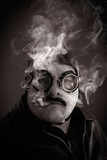
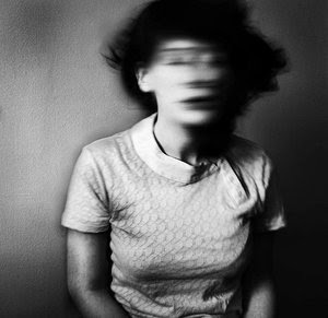
I chose two very odd self portraits that I found on google images. I chose the first one because I thought it was interesting that someone would take a self portrait of themselves with a blurred out face. I chose the second one because I liked that this guy seemed like quite a character with his goggles on and all the smoke furling around him. These might influence my own self portrait stylistically, plus they are both quite unique which gives me ideas about how to be unique in my own way.

Part 3:

http://www.artlex.com/ArtLex/s/self-portrait.html

I intend to use this website as a model for ideas when creating my own self portrait. I do like to be unique, but at the same time I like to see what other artists focus on in their own self portraits, so that I can come up with my own personally tailored ideas.


Monday, March 15, 2010

B8 Adobe Photoshop

The first Photoshop video that I watched was Making and Refining Selections. This video was helpful because it reinforced the application of the selection and direct selection tools. I personally liked how it showed me the correct way to select and move stacked objects. Next, I watched Using Layers. I like how this allows me control objects that overlap. Thirdly, I watched Converting Color Photos to Black and White. I like the black and white tool that it used, as well as the hand tinting effect. It looked really neat when that was demonstrated. Next I watched Applying Smart Filters. The most important thing I took from this video was how to adjust the Smart Filter settings after I applied them to an object. The video, Correct Lighting with Camera Raw, was definitely my favorite. I can't even say how many photos I can fix using this tool. I like that you can correct dark subjects, white balance and midtones. Too often have I taken an awesome picture and it didn't turn out because of the lighting. The next video, Making Tonal Corrections, seemed very basic for me. I already knew how to adjust color contrast, but going over how to adjust the exposure was a nice refresher. The next video, Making Color Corrections, was pretty cool because I got to see how to change the lighting in just a portion of a photograph. Going over how to convert color to black and white seemed sort of redundant though. To be completely honest, I watched the video Using Vanishing Points in Photoshop, and I think it went over my head. I tried to replicate what they were doing in the tutorial but I had a hard time figuring it out. The video Importing Content into InDesign, was nice because it showed me some shortcuts like multi file placement and quick apply. I feel like when I have more time and opportunities to play around with InDesign I will be able to feel more confident using it and its features.

Friday, March 5, 2010

Adobe InDesign Videos

Watching the tutorials on Adobe InDesign was rather informative. I have not used InDesign prior to this class, so I think they will help me out immensely. I liked how the first video showed how to use direct select on the corner points to change the shape of the objects. I like tweaking things, so this will come in handy for sure. The video on working with text was cool, because I didn't realize that I could change what language I was using. I also liked that it showed how to create real fractions and how to change something in all capitals to lower case letters. I wish MS word had options like these, it would make writing papers much easier. The third video, on text styles, seemed to go hand in hand with the second. I like that it described how to create my own style, how to save it, and how to apply it without a lot of steps. In the fourth video, creating bulleted and numbered lists seemed to be pretty simple. I think that this was the most obvious thing that these tutorials showed me how to do. I think the fifth video, on using the text wrap panel, was the most useful to me. I will definitely use this, especially how to use the contour options for detecting edges and wrapping text around images. The options made it really simple to put the text on either or both sides of an image. Finally, the sixth video, on managing pages, sort of reminded me of creating slides on PowerPoint. I did like that it had options for moving pages to specific places within a document though. I liked the female presenter, Anne-Marie Concepcion, the best because her voice was very comical and she seemed like she really enjoyed working with InDesign. The other presenters sort of reminded me of Ben Stein, rather dry and boring for my taste. Anne-Marie made the tutorials more exciting for sure.

Photobucket Slideshow

Here is the link to the slideshow I created on Photobucket.com:

When creating this slideshow, I wanted all of my pictures to be unique. Over the past weekend I
took my brother and sister to the zoo and to the botanical gardens, so I used some pictures that I took
on those adventures. Hopefully no one else went to either of those places. I also took a picture of the
stars on the window in my bathroom, because they seemed really colorful against the snowy backyards
that particular window overlooks. For line, I took a picture of the Buffalo Bills Zubaz pants that my
boyfriend was wearing while I was putting the slideshow together. I took a picture of a scrape on
the bumper of my car that I was initially going to use, but I liked his pants better for that particular
element. I think my favorite picture in the slideshow is the one I used for unity. We made sushi last
Wednesday, and I think sushi is a good way to portray unity because so many things go together into
a tiny roll of deliciousness.